eBook Cover Design Tips
By Lisa Maliga Copyright 2013
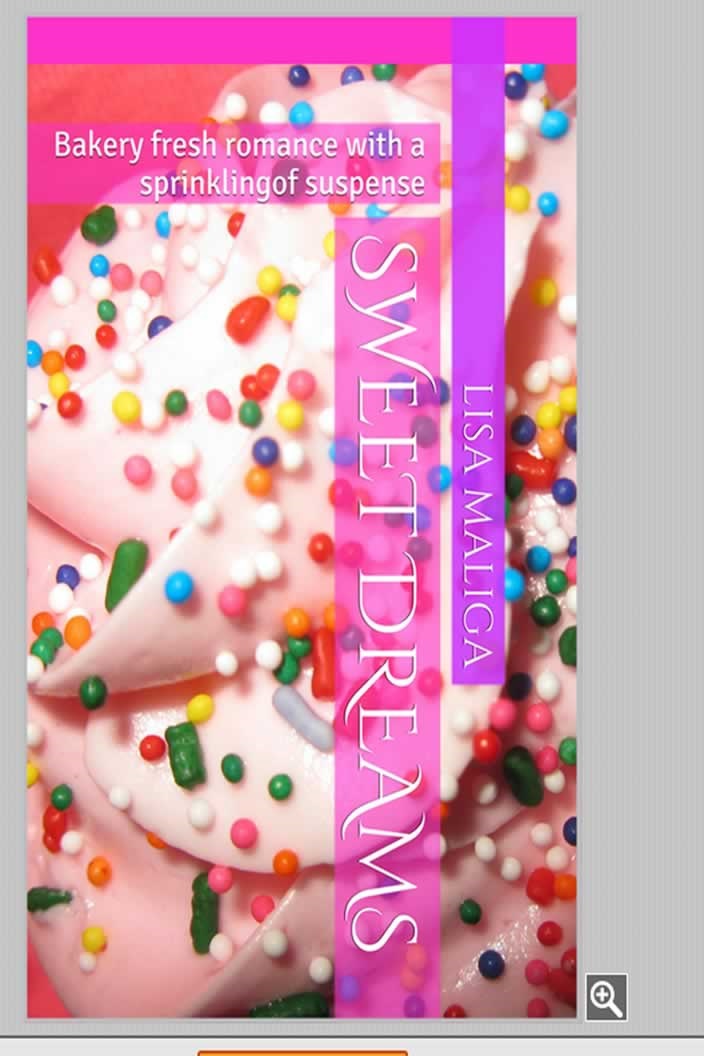
I don't usually write about creating an eBook cover because it's a different process for each title. It's not just the initial canvas--what color is the background? Will I use a photo? Another important consideration is the font. And what color will that font be, what size, etc. Creating my first romance novella's cover was simple: I wanted something to reflect the title and that was a cupcake with sprinkles. I thought it emphasized the title along with the fact that bakeries and baked goods are featured in the storyline. I bought a six-pack of cupcakes from the supermarket and took a few photos. They looked good. They looked better after I enhanced the cupcakes with extra multicolored sugar sprinkles. Cupcake photo ready to go, I thought I'd try Amazon's Cover Creator. Here's the result after ten minutes of fiddling about with it: [NOTE: click to enlarge image]
I wasn’t too crazy about the vertical lettering but I like the Cinzel Decorative font.
There were two issues. The Cover Creator is designed for eBooks sold on Amazon, not those sold at other online stores like B&N Nook, Smashwords, Kobo, or elsewhere. Also, while cupcakes played a part in the story, so did a fancier French pastry: the macaron. That idea for a book cover popped into my head – a stack of macarons. Not just a single stack of strawberry or chocolate macrons, I envisioned pastel colors of pink, yellow, green, and orange.
Why not try a stock photo? I discovered these: http://www.istockphoto.com/search/text/french%20macarons/filetype/photos/source/basic#17bcc90
So many macarons! So beautiful, bright, luscious looking! I was hungry after clicking through the assortment. I found just the right photo for my cover. Until I tried to buy it. I couldn't get just one, I had to buy several. So, I decided to do it my way—take my own photos of the lovely photogenic macarons. I bought the fancy French cookies knowing I'd have to eat the results of my sweet photo shoot! :)
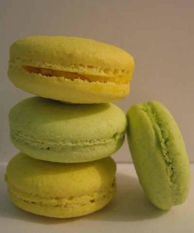
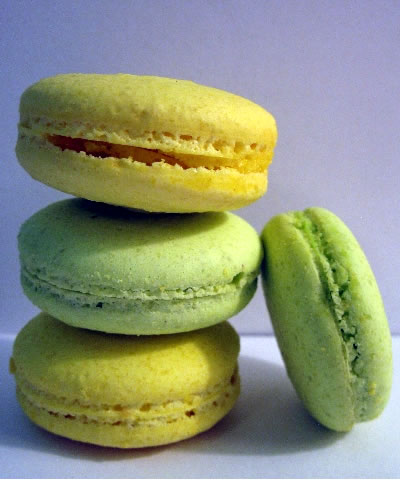
I opted for yellow and green – lovely colors. A little subdued, though. This was taken indoors in natural light but it wasn't bright enough to show the white background.
I clicked on the auto enhance button and the background turned a nice shade of sky blue.
It looked good at 25% but at 100%, I saw a lot of background noise.
Scratch that cover idea.
I got creative and decided to do two stacks utilizing all the colors—totaling seven macarons. Seven almost perfect macarons. I later noticed the little crack in the left Key Lime macaron but thought it looked even more realistic. After all, these are very delicate cookies. They're made with egg whites, never any yolks, granulated sugar and powdered sugar and finely ground almond flour.
There were three different backgrounds: white, pink and a soft blue. I thought white was too stark, pink too common, and the blue was enough of a contrast to make the bright colors pop.
Keep in mind I'm working with .PNG files at a 300 dpi capacity and the dimensions are 1600 x 2400—standard eBook cover size. So I take the double stack of macarons and remove the background thanks to the handy Magic Wand tool that Fireworks provides for people who are too lazy to actually cut out the background. With the white background, I can stay with that look or add color. As you can see, I added color. I also fiddled around with the settings so that I got brighter shades for more visual impact, although they're actually quite close to the original colors. As I photographed them indoors I used as much lighting as possible.
After taking 200+ digital photos, here's the final result:


